Shoppers Drug Mart: Going Mobile
Creative Direction, Strategy, UX, Design, Production
Design and production of an internal campaign focused on transforming the future of work
Shoppers Drug Mart was focused on the future and were empowering their staff with remote working through VPN, wireless setup, secured Google applications, “bring your own devices” initiatives and via their own Intranet. In order to communicate the new program, they required a brand that lived as an extension of the Shoppers Drug Mart identity, but integrated the concept of a wireless world and their partnership with Google.
Through creation of the branding itself, development of iconography, internal signage for stakeholder leaders, posters, e-blasts and branded scrum rooms specific to the initiative, the platform was a success and moved their workforce into the future.
THE ASK
STRATEGIC EXERCISE
1. COMMUNICATING MOBILITY
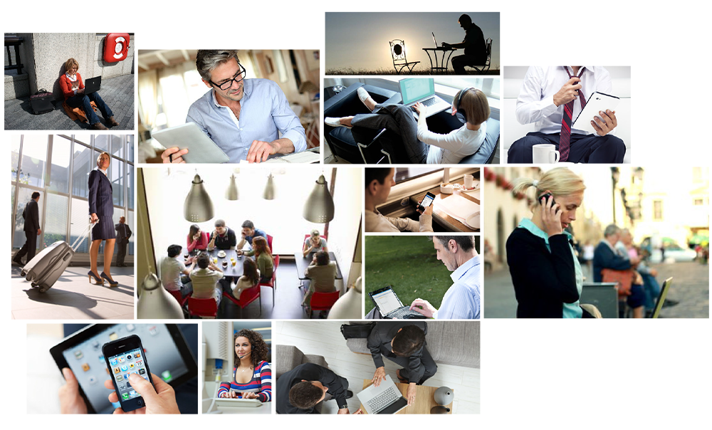
To express the ideology of Going Mobile, focus was placed on the core tenet: the ability to work anywhere as productively as one could at the office, in any situation or time.
The ability to access email, files, create or review documents on any device without an interruption to workflow. To communicate the opportunity and excitement of the program, focus was placed on the key benefit; the freedom of working anywhere.
2. COMMUNICATING PLATFORM
To create an instant connection with Shoppers Drug Mart and Google, focus was placed on communicating the development platform for a direct tie in of Google with Going Mobile, achieved by leveraging Google colours.
Due to their primary base colour nature, we are able to relay another albeit subtle concept, through the definition of “primary”: “First or highest in rank, quality, or importance; principal.”
4. COMMUNICATING INTENT
To communicate the concept of Going Mobile, simple iconography was utilized for the various channels.
Focus on clear messages became the core approach, with simplified graphics and bold, primary colours - the result is a cohesive system that is both playful and instantly understandable.
3. COMMUNICATING “ANYWHERE”
Things we take for granted now, were foreign a few years ago. However there were still some knowns and I looked at iconography synonymous with communicating the concept of “anywhere”: WiFi, Bluetooth, LTE, 3G, 4G and modems for wireless networks.
These standard platforms utilize similar visuals and iconography to describe the technology which people immediately associate with wireless mobility. Speak the same language our audience already understands.
BRANDING
The integration of signal bars on the mortar and pestle immediately speaks to mobility, again something taken for granted today, but truly a unique approach when this campaign was introduced.
Utilizing Googles colours as a primary reference point within the wordmark, then italicized to emulate motion, creates the relationship between the program and the technical development foundation, without removing emphasis from the Shoppers Drug Mart brand.
PROGRAM ICONOGRAPHY
The main program features: WiFi, Intranet, Bring Your Own Device and Google Apps used an iconography system fixed within the background of mortar and pestle visual to draw a consistent visual thread and leverage the Shoppers Drug Mart platform for pattern recognition.
These symbols were utilized in communication throughout Shoppers Drug Mart, through posters, e-blasts and circulars.
SECONDARY ICONOGRAPHY
Highlighting the main Google Apps available as part of the Going Mobile initiative.
TERTIARY ICONOGRAPHY
Development of iconography for use throughout the internal requirements of Shoppers Drug Mart, to communicate the various services and platforms available.


