An International Football Competition
Creative Direction, Strategy, UX, Design
Building a one-of-a-kind fresco: The future of video.
Sworn to secrecy to never say the name of the football match organization to avoid those pesky lawyer-driven bots always on the look-out, this Brazilian set football match was a global event for football. ogo above showcases the Games in which an augmented companion installation was created.
Cisco’s approach when creating infrastructure is one of connecting people, process, data and all things on the network. As part of this global football event, showcasing new technology only solidifies yourself as the leader in the field. The platform supports 4K resolution video and is designed to demonstrate the future trends in video watching.
OVERVIEW
THE TECHNOLOGY
Televisions placed on the wall housed static wallpaper content matching the wallpaper in the room, due to technology limitations the bezels still showed, however in future iterations the intent would be for the screen to be a large sheet affixed to the wall, with our information and video simply floating in space.
The “rig” was based on custom configured hardware (two PCs driving a total of 9 HD screens) with customized Chromium browser software that creates one virtual surface out of the 9 screens. Combined with a playback synchronization server and a node.js orchestration engine.
The goal was to create a series of “widgets” in which information regarding the match could display in conjunction with 4k streaming of the game itself. There were no limitations for this project, and the developers were hungry for some “out of the box” thinking. No obvious grid system, no layout that was simple and expected - so I played, and pushed it.
The realization came that while we wanted to stay clear of a grid or traditional layout, there had to be some sort of connectivity of content to itself, and some sort of connectivity to the conceptual brand of the tournament were were representing.
DESIGN CONCEPT
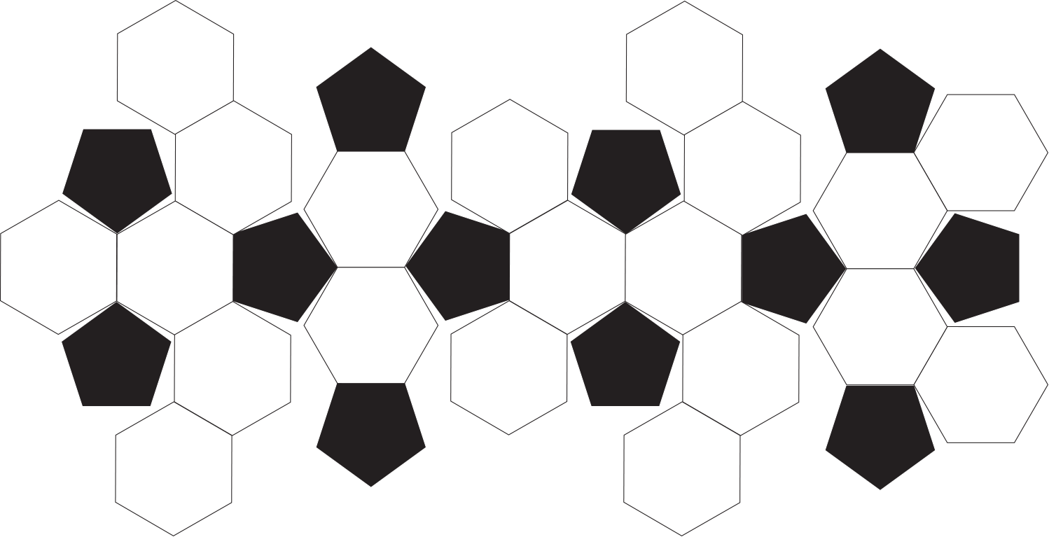
I found my connective grid in an obvious place, that was hidden to me until I was pulling on the seams of an old soccer ball sitting by a campfire trying to ideate some kind of genius. As I peeled back the synthetic leather I realized what I was seeing, and much like a flattened map vs. the globe, it became clear the path we were going to take.
Weird that my head didn’t go directly to the truncated icosahedron for inspiration, am I right?
Continuing to conceptualize, I found the system with twelve pentagons and 20 hexagons.
The geometry of a simple soccer ball lent itself to compartments and nodes that could display information as required. While the full sum of the parts was never displayed, its component elements turned on and off, positioned themselves on screen in various locales, and the intent of visual was immediately present. The nodes housed content and could expand within their area as required based on necessity of overflow.
DESIGN CONCEPT, UX LAYOUT
Player information
Timer
Twitter Feed
Goal
Time since last goal
Lead scorer
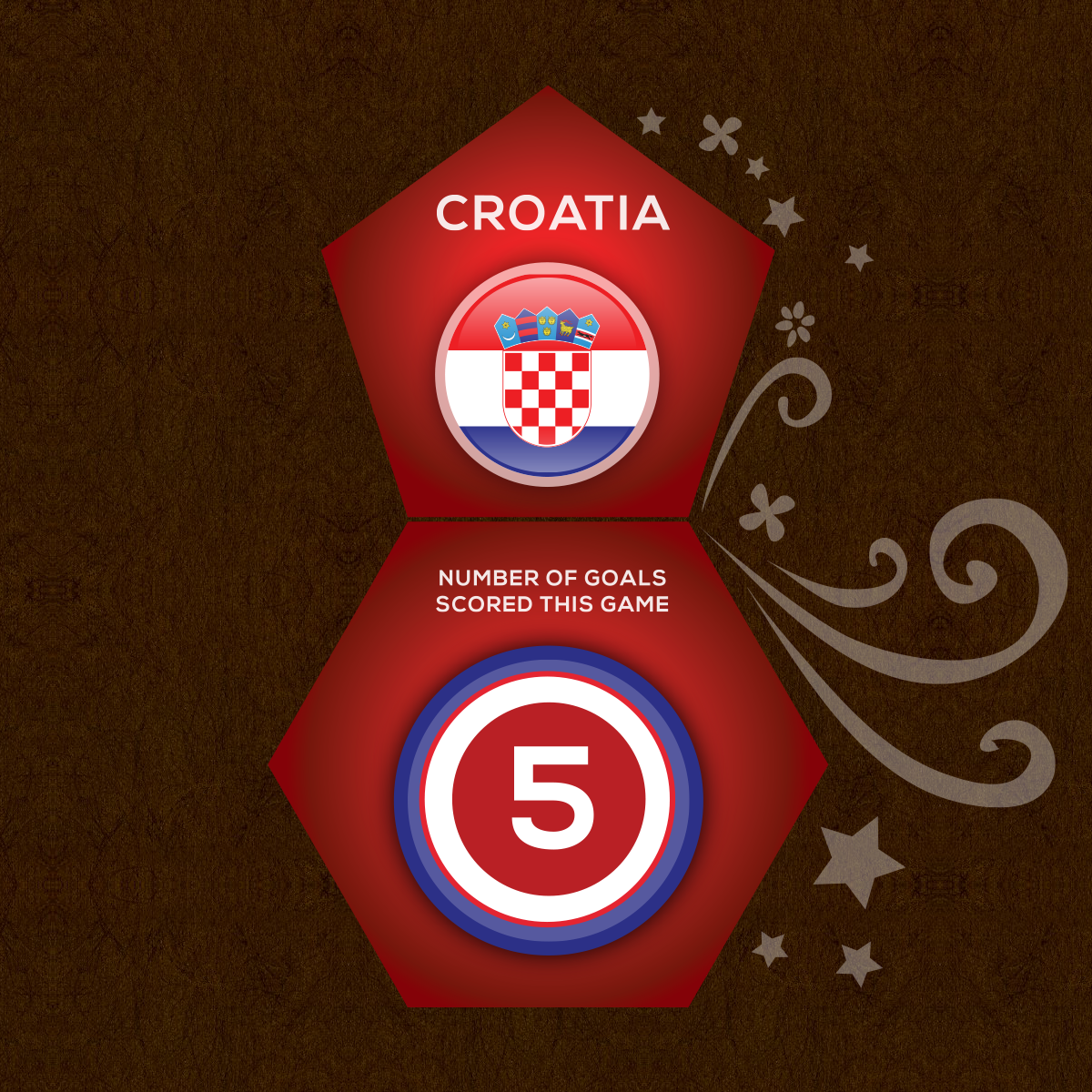
Utilizing inspiration from a design perspective, the “nodes” featured additional illustrated elements that emulated other decorative elements that made up the events visual language in posters, signage and promotions, and combined with the pentagons and hexagons, created a uniquely Brazilian/event specific visual.
With simple design elements of flags and background colours, widgets were able to be altered for all 32 teams involved in this competition
Side screen content focused on interactive player merchandise where users could theoretically purchase team jerseys, equipment and various swag items through an ecommerce connection, as well as advertising and game play callout opportunities


